
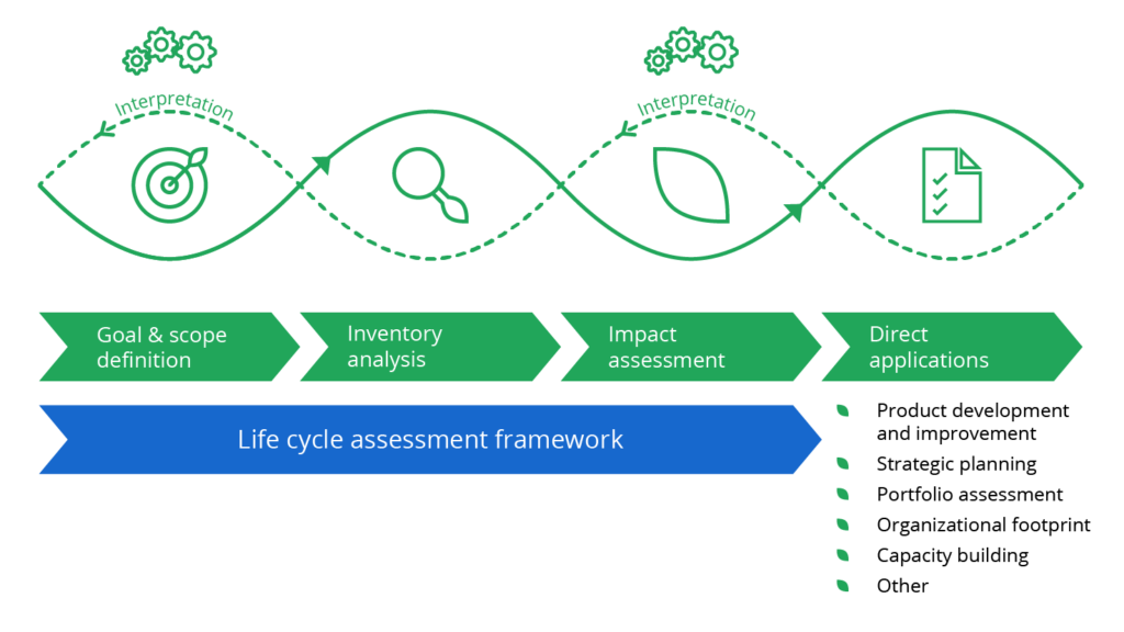
The Project
Designed a new Portfolio Comparison Report feature for Portfolio+, enabling users to compare up to five sustainability assessments side-by-side. The goal was to support faster, data-informed decision-making by visualizing environmental impact and trade-offs across multiple products or projects.
This feature was developed in close collaboration with sustainability experts and product stakeholders, ensuring the experience aligned with real-world analytical workflows and industry expectations.
The Problem
Users lacked an efficient way to compare sustainability performance across multiple assessments. Existing tools required opening reports one by one, making it time-consuming and difficult to identify trends or make strategic decisions across a portfolio.
This gap limited the ability of environmental analysts and business stakeholders to:
Benchmark product performance at a glance
Justify investment or material changes with comparative data
Confidently communicate insights to clients and internal teams
The challenge was to design a new comparison experience that surfaced key metrics, enabled flexible benchmarking, and presented complex LCA data in a clear, digestible format.
The Solutions
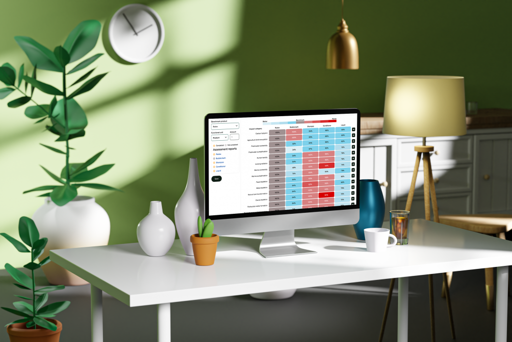
A new comparison report interface that makes complex sustainability data easier to analyze, benchmark, and act on.
The solution was designed around clarity, flexibility, and expert-aligned decision support. Key elements included:
Side-by-side comparison of up to five assessments, allowing users to evaluate environmental performance across multiple products or projects at once
Toggle between percentage-based and absolute values, giving users control over how they interpret and present data
Clean, accessible tables and visual indicators, prioritizing legibility over heavy data visualizations like trellis charts, which were avoided due to user feedback
Category-based filtering and benchmark selection, enabling users to focus on key environmental indicators relevant to their goals
Integrated guidance patterns, helping less experienced users interpret results confidently while supporting power users with speed and control
This design balanced the depth needed by LCA professionals with the clarity and usability required by business stakeholders.
Deliverables
Web App
UI Branding
Design system
Team
Technical Lead Developer
UI/UX Designer
Product Owner (PO)
Scrum Master
Tester
What We did
UI/UX Research
UI/UX Design
Client’s Goals
Enabling data-driven sustainability decisions at scale
The client needed a feature that would expand the platform’s analytical capabilities and reinforce its position as a professional-grade LCA tool. Core business objectives included
Increase Product Differentiation
Introduce comparison capabilities not commonly found in competitor tools to stand out in the sustainability software market.
Improve User Engagement and Retention
Deliver meaningful new functionality to increase platform value and drive repeat use among analysts and sustainability consultants.
Support Decision-Making at Portfolio Level
Equip users with the tools to benchmark and justify decisions across multiple products, clients, or projects in one view.
Align with Sustainability Expert Expectations
Ensure the feature design met technical requirements and analytical workflows of LCA professionals, enhancing credibility and adoption.
Target Audience
Primary Users
Environmental Analysts working in consultancy or in-house sustainability teams
LCA Specialists focused on technical accuracy and data interpretation
Sustainability Managers need to compare product or supplier impacts across a portfolio
User Needs
Quickly benchmark multiple LCAs to identify environmental trade-offs
Present clear comparisons to support recommendations or client reports
Maintain confidence in the integrity of technical data
Behavioral Patterns
Work with detailed LCA outputs and datasets
Balance expert-level analysis with time constraints and reporting deadlines
Rely on tools that align with industry standards and best practices
Core Features
Side-by-Side Comparison Table
Toggle Between % and Absolute Values
Custom Benchmark Selection
Impact Category Filters
Guided Interpretation Patterns
Additional Features
Responsive Layout for Tablet & Desktop
Accessible Table Design (WCAG-Compliant)
Export to PDF for Reporting
Contextual Tooltips for Metrics
Consistent Theming with Core Platform UI
Achievements
Feature Adopted Across Key Client Accounts
The comparison report became a valuable tool for enterprise users needing to evaluate sustainability across multiple projects.
Aligned with Expert LCA Workflows
The final design met the expectations of technical sustainability professionals, supporting both depth and usability.
Strengthened Product Differentiation
Helped position Portfolio+ as a more advanced, decision-support-oriented sustainability platform in a competitive landscape.
Positive Feedback from Usability Testing
Test participants highlighted the clarity of layout, usefulness of the toggle view, and confidence in making faster comparisons.
Improved Reporting Efficiency
Users reported less manual work when comparing results, with a faster path to identifying trade-offs and key insights.
Information Architecture
Organising information flow for intuitive and efficient user journeys.

User Interface (UI) Design
Project Management
We chose the Agile methodology for this inventory software development project because it supports iterative development and adapts easily to changing requirements. This approach allowed us to make frequent updates and continuously improve the project based on feedback.
Sprints
We divided the project into short development cycles (sprints) with frequent releases and updates that kept the project on track
Communication
We used teams and Jira for project management to organize tasks, track progress, and collaborate efficiently with maximum visibility.
Cross-functional Teams
Our developers, designers, and testers worked closely together to ensure seamless integration and high-quality outcomes.
User Feedback
We placed a strong emphasis on user feedback to drive iterative improvements.
Let’s Talk About Your Project
Tell us what you’re building, and we’ll take it from there.
Please fill out the form to schedule a free 30-minute discovery call where we understand your idea, offer early advice, and suggest the best next steps.