Redesigned a mobile banking app to simplify money transfers, improve user navigation, and increase task completion speed. The goal was to make everyday banking more intuitive and efficient, especially for users managing frequent transactions on the go.
As the sole UX/UI designer, I led the product end-to-end, from initial research and user interviews through to wireframes, testing, and high-fidelity design. The result was a streamlined user experience that reduced task friction and aligned with business goals for user retention and satisfaction.
Problem
Users were struggling with basic tasks like sending money or checking balances, often navigating through multiple screens to complete simple actions. The existing app experience felt cluttered and unintuitive, especially on mobile.
From a business standpoint, this friction led to lower engagement and increased customer support queries for tasks that should have been self-service. The challenge was to simplify core banking flows without compromising functionality or security, while also making the app feel modern and trustworthy.
Solutions
I redesigned the app with a clear focus on speed, clarity, and user trust. Key changes included:
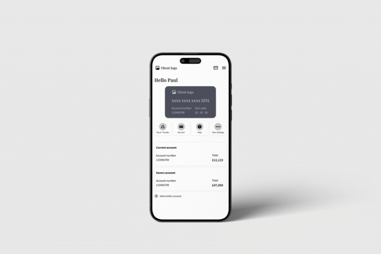
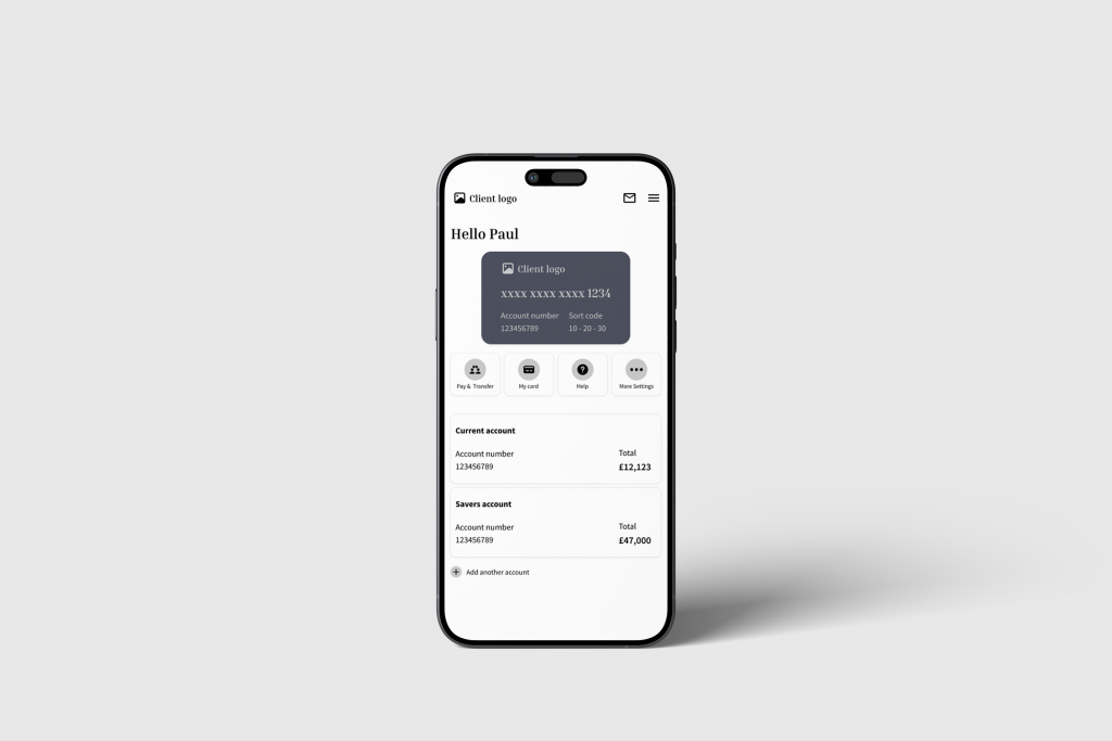
Streamlined Transfers: Simplified the send money flow from five steps to three, making it faster and easier to complete repeat transactions.
Simplified Navigation: Reorganized core features using a bottom tab bar and consolidated redundant screens for quicker access to essentials like balances, transfers, and transaction history.
Smarter Defaults & Clarity: Pre-filled frequent recipients and used progressive disclosure to reduce cognitive load while maintaining transparency.
Modern Visual Language: Applied a clean, accessible UI with consistent iconography and clear calls-to-action, reinforcing confidence in a secure environment.
These solutions reduced time-on-task and helped users complete banking actions with fewer errors and more confidence.
Deliverables
Moblie app
Design system
UI Branding
Team
Technical Lead Developer
UI/UX Designer
Product Owner (PO)
Scrum Master
Tester
Front-end developer
Back-end developer
What We did
UI/UX Research
UI/UX Design
Development
Client’s Goals
The client aimed to modernize the mobile banking experience to stay competitive with digital-first fintech apps. Key objectives included
Reduce User Friction
Simplify core flows like money transfers and balance checks to speed up task completion and reduce drop-offs.
Lower Support Inquiries
Minimise user confusion by creating clearer interfaces and predictable interactions, reducing reliance on customer service.
Increase Feature Adoption
Enhance the visibility and accessibility of underutilised tools (e.g., scheduled payments, budgeting features) by improving navigation and providing contextual prompts.
Improve Retention & Satisfaction
Deliver a smooth, mobile-first experience that builds confidence and encourages continued usage.
Target Audience
Primary Users
Adults aged 25–45
Digitally literate, using mobile as their primary banking channel
Often balancing work, family, and time-sensitive transactions
User Needs
Quickly send or receive money
Check balances and transactions at a glance
Perform routine tasks with minimal friction or errors
Redesigned flows like transfers and bill payments led to significant reductions in time-on-task, improving efficiency for daily users.
↓ 31% Reduction in Support Queries
Clearer layouts and simplified flows reduced user confusion and the need to contact customer service.
Positive User Feedback in Post-Launch Surveys
Users described the new experience as “faster,” “easier to use,” and “much more modern,” validating both functional and emotional improvements.
↑ 24% Increase in Feature Engagement
Better navigation and clearer UI boosted usage of features like scheduled payments and transaction filters.
SUS Score: 82 Rated “Excellent” Usability
Post-launch usability testing confirmed strong user satisfaction, meeting the project’s UX quality targets.
Information Architecture
Organising information flow for intuitive and efficient user journeys.
User Interface (UI) Design
Technology Stack
Frontend
React JS
Material UI
Backend
Next.js
PostgreSQL
AWS
Firebase
Project Management
We chose the Agile methodology for this inventory software development project because it supports iterative development and adapts easily to changing requirements. This approach allowed us to make frequent updates and continuously improve the project based on feedback.
Sprints
We divided the project into short development cycles (sprints) with frequent releases and updates that kept the project on track
Communication
We used teams and Jira for project management to organize tasks, track progress, and collaborate efficiently with maximum visibility.
Cross-functional Teams
Our developers, designers, and testers worked closely together to ensure seamless integration and high-quality outcomes.
User Feedback
We placed a strong emphasis on user feedback to drive iterative improvements.
Let’s Talk About Your Project
Tell us what you’re building, and we’ll take it from there.
Please fill out the form to schedule a free 30-minute discovery call where we understand your idea, offer early advice, and suggest the best next steps.